You’re offline. This is a read only version of the page.

The ESP+ Knowledge Base is a quick-access hub of articles, videos, and content designed to help you navigate ESP+ with confidence and efficiency.

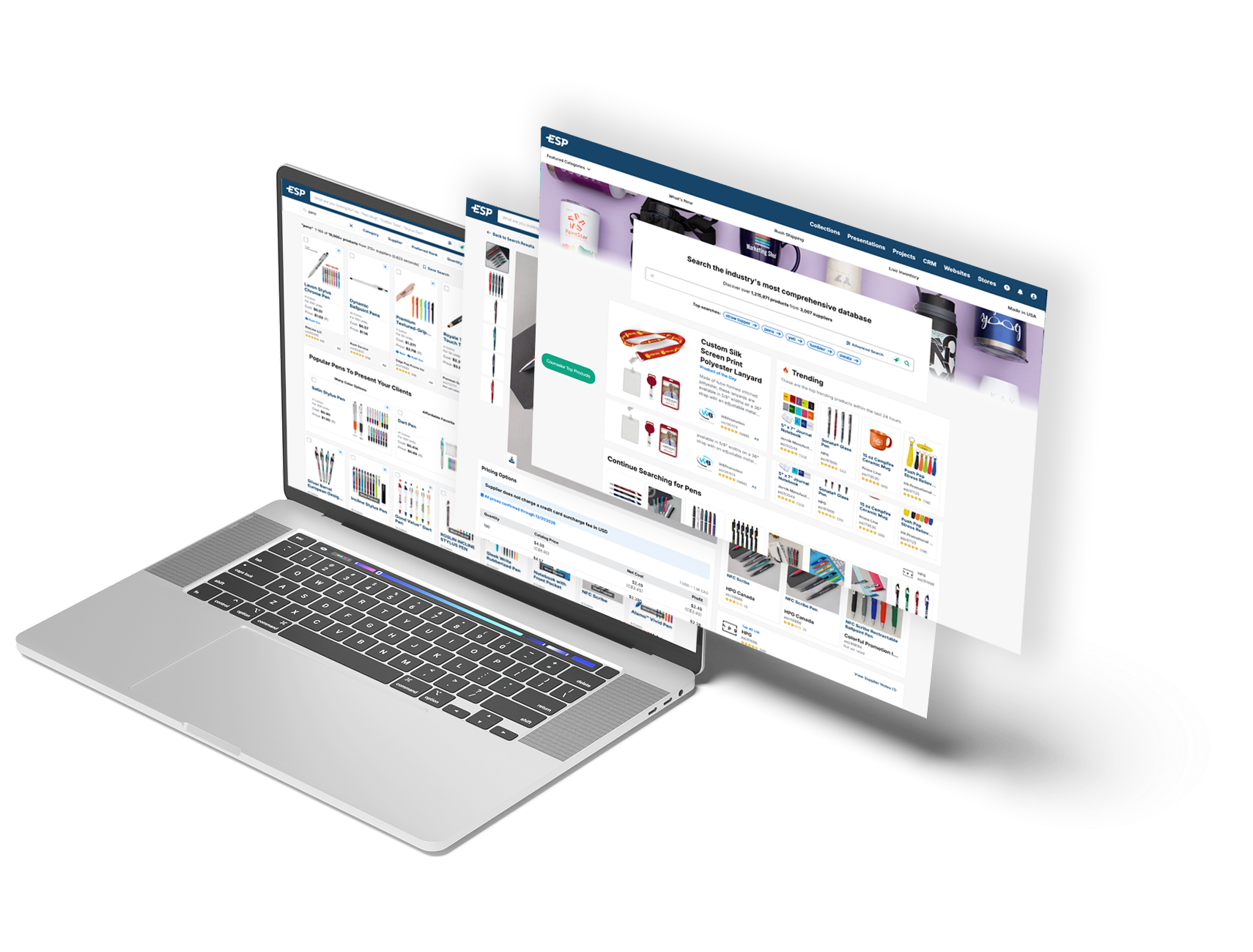
See our best features in action! Click on the thumbnail to launch a video.



Create New Website
Domains and Redirects
Customize Site Content
Manage Site Navigation
Create a Store
Manage Store Products
Order Aggregation
Manage User Accounts
Expand a category to view our step by step articles!
To learn more about a specific feature or application, click on it from the image below.
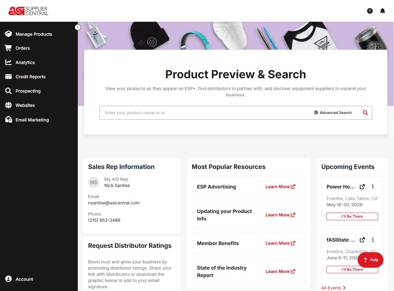
Collections are a helpful tool that enables users to hold products for use in Presentations.
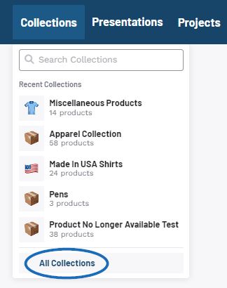
Click on the Collections button on the main toolbar. The five most recent collections will be displayed, but you can click on the View All Collections link to open the main Collections area.
Collections are owned by a single user within your company, but additional users can be added as collaborators. Use the Sort By to organize the Collections.
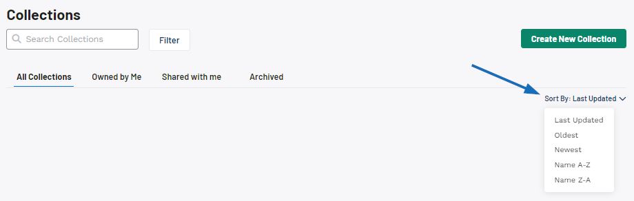
When viewing Collections, there are four tabs:
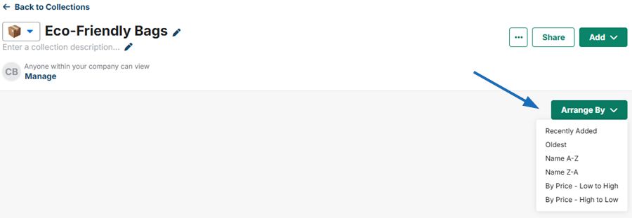
Clicking on a collection name will open it in an editable state. Use the pencil icon to update the collection name and description. Products within collections can be arranged by:
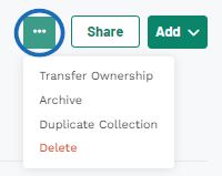
The three dot icon enables you to manage the collection. The options will vary depending on ownership of the collection, as only owners have the option to transfer ownership. Archive will deactivate the collection and it will only be shown in the Archive tab. At any point in the future, the collection can be made active again. Duplicate Collection will create a second collection identical to the current one. Delete will completely remove the collection from ESP.
Collections enable the ability for both ownership and collaborators. While there can only be one owner, multiple collaborators. An owner is a user who maintains primary possession or ownership of a project or collection. A collaborator is a user who is able to manage a project or collection but will not be able to transfer the ownership. Collaborator can use the Shared with Me section to locate projects and collections for which they are collaborators.
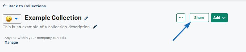
The Share button enables you to share a link to collection via email or link.
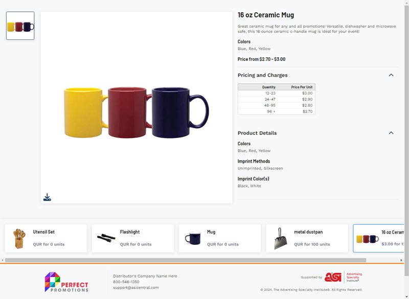
When sending a collection, you do not need to create a project, but the page will contain a footer with your company's contact information and logo.
The products within a collection can also be added to a presentation and/or an order.
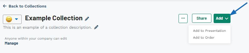
To add all the products within a collection to a presentation or an order, expand the Add menu and then select the desired option.
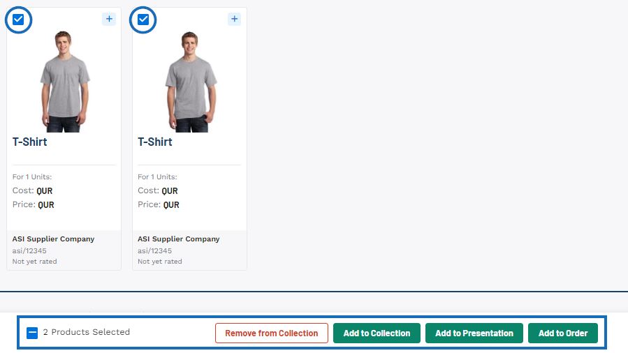
To add specific items within a collection to a presentation or an order, click on the checkbox in the upper left corner of the product thumbnail. A toolbar will appear at the bottom. From this toolbar, you can choose to:
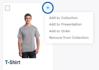
To add a single item within a collection to a presentation or an order, click on the plus sign in the upper right corner of the product thumbnail. A menu will appear with the following options:
A collection is a group of products which can be used in a presentation or just saved for later. If you are just getting started with Collections, click on the All Collections option from the main toolbar.

In the main Collections area, click on the "Create New Collection" button.

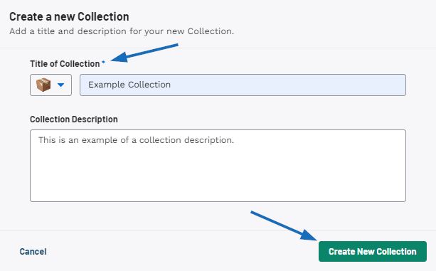
Enter a title for the collection, then use the icon drop-down to select a custom image and enter a description if desired. When you are finished, click on the "Create New Collection" button.
After creating a new collection, you can use the search bar to add products to the collection. After entering the search terms in the bar at the top, mark the items you would like to save to the collection. A toolbar will appear at the bottom with a button to "Add". Clicking on this button will open a drop-down menu. Click on the Add to Collection button. A pop-up window will open where you can select the collection, and the section of the collection. After making the selections, the products will be saved and a success message will appear at the bottom.
Watch how to add products to a new collection
For more information, please review the Collections article.
To create a standalone quote, order, invoice, or sample request, first click on Orders in the main tool bar, then click on Orders.
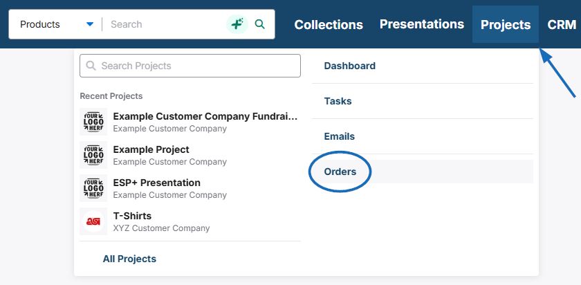
Next, click on the "Create" button.
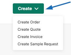
Select the order document type that you want to create. A window will open with your recent projects. To create the order document without a project, select the "Skip for Now" option.
Two important things to keep in mind about using the "Skip for Now" option:
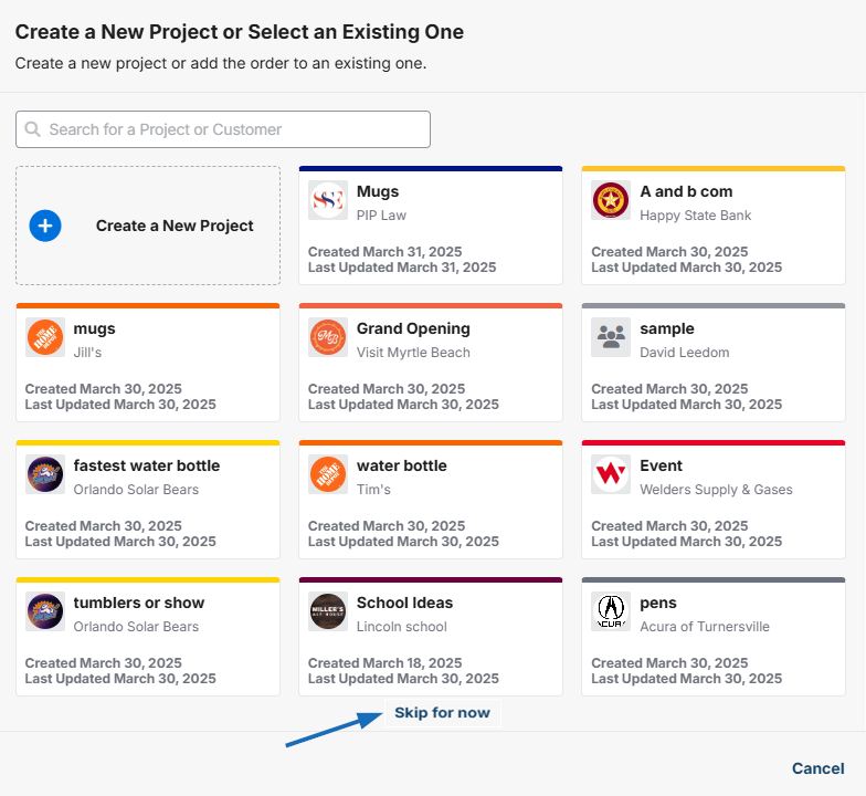
Another winow will open with recent companies from your CRM. If you do not see the company you want to create the order document for, use the search bar to locate the company. Or, click Create a New Customer and fill out the form.
In the Create a New Order window, fill in as much information as possible. Please note that the Date, Sales Person, and Order Contact are required. Once you are finished filling in the fields, click on the "Create" button.
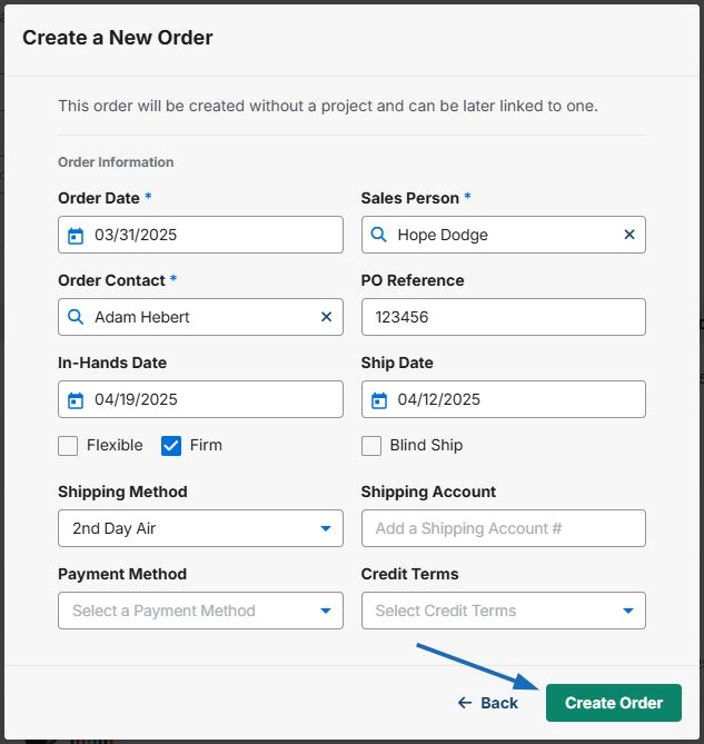
Once the document has been created it will open automatically. You can then add products and/or services to the order document.
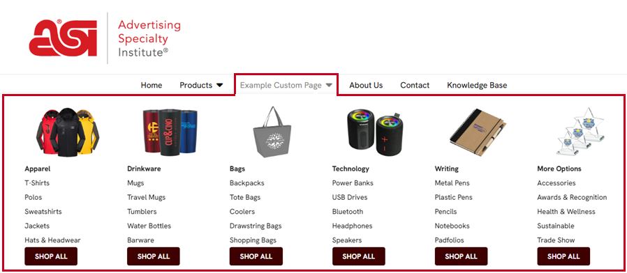
Mega Menus on ESP+ Websites enable you to enhance your website navigation with large, structured dropdown menus. Instead of simple link lists, Mega Menus can include multiple columns of images, links, buttons, text, and tiles to help visitors find products faster and improving the overall browsing experience.
Mega Menus are managed directly within the website admin and do not require custom development or coding.
Log in to ESP+ and select Websites from the main toolbar.

Locate the website you would like to update and click on the thumbnail.
Go to the Pages section and select Header from the options on the left.
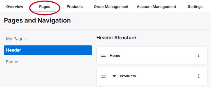
Choose an existing navigation label, link, or page to which you would like to apply the Mega Menu. Click on the three-dot icon and select "Add Mega Menu".
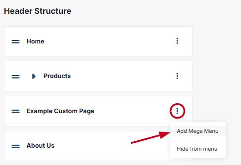
It is important to note that Mega Menus cannot be added to navigation items that have nested links, nor added to the nested items themselves.
Select one of the available options from the Templates section:
Click on the element you would like to use and then click on the "Add Element" button.
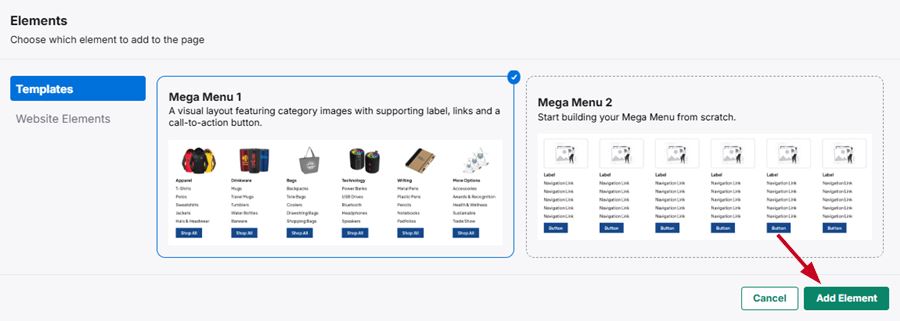
Mega Menus are built using modular components which enables you to update specific sections without rebuilding the entire menu. You can add up to five (5) elements per menu column with up to six (6) columns per menu. The element options are:
It is important to keep in mind that deleting a column will remove the image, links, and buttons completely. If the deleted column is added back to the Mega Menu, you will need to customize it. Also, changes are not visible to visitors until the site is published.
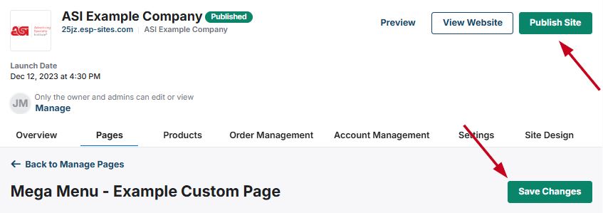
When you are finished configuring and updating the columns and elements within the Mega Menu, click on the "Save Changes" button. Then, use the preview to ensure the Mega Menu is displaying and functioning properly. When you are ready, click on the "Publish" button.
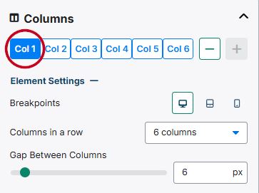
Each section of the Mega Menu is contained within a column and can contain multiple elements.
Within each column, users can add supported content elements—such as navigation links, images, and buttons—to guide visitors through key areas of the site. This component-based approach allows distributors to update navigation content without rebuilding the entire menu structure.
A single mega menu can support up to six individual columns, allowing for complex layouts that accommodate large navigation sets or mixed content types. Changes made at the column level affect how all nested elements are displayed together within the mega menu.
The content for each column can be accessed by clicking on the column number. Use the "-" and "+" buttons to remove or add buttons.
Expanding the "Element Settings" section will enable you optimize the column settings themselves. The first option, Breakpoints, enables you to optimize the column display for a standard monitor, a tablet, and a phone. Clicking on each icon will change the "Columns in a row" amount to display best on that device, but can be updated using the drop-down.
The third option in this section is the "Gap Between Columns" slider which enables you to increase or decrease the spacing between columns in each row.
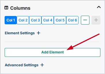
Click on the "+Add Element" button to open the Elements window. Then, select the element you would like to include in the Mega Menu and then click on the “Add Element” button.
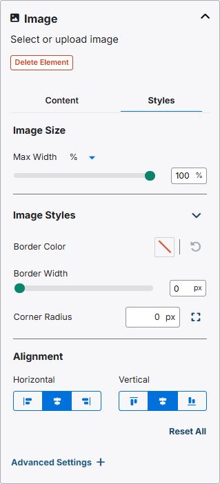
Use the arrow to expand the image section. There are two options: Content and Styles.
To change the picture for the column, click on the trash can icon. Then, click on the “Choose Image to Upload” button to browse your computer for the image or click on the “Select from Library” button to choose an image from the Asset Library. You can also drag and drop an image to the available box.
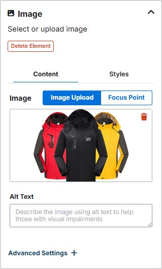
After the image has been uploaded, use the "Focus Point" option to direct the focus and zoom for the image.
The styles section enables you to customize the image settings within the column. The first option is to the option to select an image unit and update the size.
Next, you are able to use the "Image Styles" options to add and configure a border, as well as use the Corner Radius to curve the corners of the image.
In the "Alignment" section, you can align the column horizontally as well as vertically.
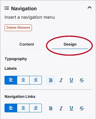
The navigation enables you to set links to specific pages, links, or predefined searches in the Mega Menu. Use the arrow to expand the navigation section. There are two options: Content and Design.
The content section enables you to update, add, and redirect the label and navigation links within the menu. To update a label or navigation link, click on the three-dot icon and select the "Rename" option.
If you would like to have the links displayed without a label, select "Hide From Navigation" from the drop-down.
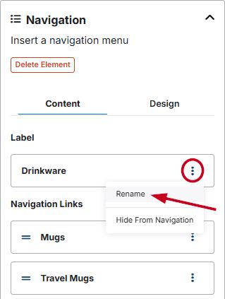
This will open the label where you can update the label title, as well as direct visitors to your site to a specific page on your ESP+ Website or specific page or website. You can also use the slider to open the link in a new tab. When you are finished, click on the "Save" button.
In the Navigation Links section, the drop-down options will also provide the option to duplicate or delete a navigation link. The links in this section also contain a two line icon which will enable you to reorganize the link order by dragging and dropping.
The design section enables you to modify the typography for the label and the navigation links.
This section enables you to add custom button to the Mega Menu. Use the arrow to expand the section. There are two options: Content and Design.
The content area enables you to update the text as well as direct visitors to your site to a specific page on your ESP+ Website or specific page or website. You can also use the slider to open the link in a new tab.
The design section is where you can style the button, set the size, alignment, and margins.
The text box will enable you to configure the text as needed within the column. Use the options available on the toolbar to modify the appearance of the text.
You will be able to configure up to four (4) tiles within the menu. To update the image, click on the “Choose Image to Upload” button to browse your computer for the image or click on the “Select from Library” button to choose an image from the Asset Library. You can also drag and drop an image to the available box.
Next, enter alt text for the tile image. Alt Text provides browsers with a short description of the image and can be read by screen reader software.
After the image has been uploaded, use the "Focus Point" option to direct the focus and zoom for the image.
Then, enter a header for the tile and select the destination when visitors click on the tile: an existing page on your ESP+ Website or to a new website. Set the designation for the link and choose whether this page or link should open in a new tab. If you wanted a tile image to serve as a standalone image, upload the image and add the alt text, but then leave the header and destination fields blank.
When you have finished configuring the first time, click on the “Add Another Tile” button to configure additional tiles for this element. The size and shape of the tiles will update automatically readjust to fit within the width of the column.
The Product Detail page will display all information about a specific item.
What section would you like to know more about?
The product image will be selected by default and displayed in the main image area. Hovering on the main image enable you to zoom in on the photo. To download a copy of an image to your computer, click on the Download icon in the upper right corner of the main image.
All image thumbnails will be listed to the left of the main image. If the supplier has provided any videos, they will be shown as a play button after the image thumbnails.
Watch this short video of the Images section in action!
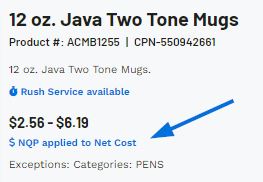
In the upper right corner, general descriptive information about the product will be displayed.
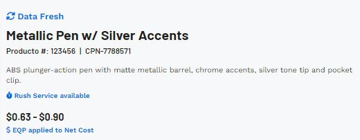
This information includes:
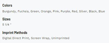
The Quick Info section will display the available product colors, sizes, materials, shapes, and imprint methods. If the supplier has not provided information for a field, it will not be displayed.
Additionally, this section will contain three links:
The action buttons enable you to share the product with your customer, add it to order documentation, a presentation, a collection, and/or feature it on an ESP+ Store.
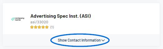
The basic information for the supplier will be shown, including their logo, company name, ASI number, and rating. If any notes have been added for this supplier, a link will appear in the upper right corner. Clicking on this link will open the the supplier detail page in a new tab. You can click on any of these fields to access their full details. To view the supplier's basic contact information, expand the Show Contact Information section.
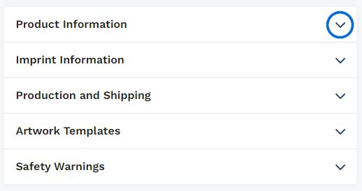
The available sections in this area will vary depending on the information provided by the supplier, but can contain up to six (6) options which can be expanded by clicking on the arrow.
If the Supplier has put this item on a special, such as Free Setup or NQP, a blurb will appear below the product image and above the pricing options describing the special.

If you used the "Get Inspired with AI" option to conduct your search, directly below the image on the product detail page, there will be a section containing information on how this product would be beneficial for the search terms you provided.

An item may contain multiple price grids depending on its attributes. For example, a T-Shirt might be one price for standard sizes but cost more for extended sizes.
If an item contains more than one base price grid, use the dropdown under Base Pricing Option to select which pricing information you would like to view. You can also click on the View all Price Grids link to see all pricing options.
Watch this short video of the Pricing Options in action!
If a product contains inventory information provided by the supplier, it will be displayed in the inventory section. Use the dropdown to choose the option for which you would like to view inventory information or click on the View Inventory Grids to see the information for all options.
After an item has been added to a quote, use the Configure Product button to update the product information, including quantities, decoration details, and additional charges.
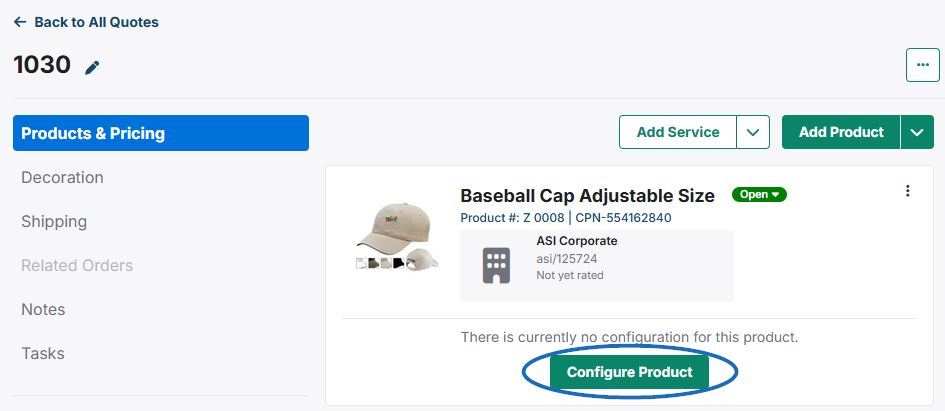
Note: If the product has been configured previously in a presentation, order document, or submitted from the customer via their portal, click on the three-dot icon and select Edit to modify the product information.
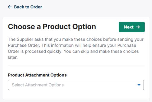
When configuring a product, if there are multiple product options available, you will need to select the one you would like to order. Then, click on the Next button.
Note: You will be brought directly into the Quantity section if the item does not require product options.
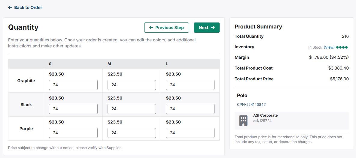
In the Quantity section, use the available pricing grid to enter the amount for the available variants (colors, sizes, shapes, materials, etc) you would like to order. The Product Summary section on the right will update with each quantity you have entered. The Product Summary will include:
When you are ready, click on the Next button.
In the Decoration Setup section, you will be able to import, add, or modify the decoration information.
If you have worked with this customer before and have a saved decoration template, you can click on the Import a Decoration button.
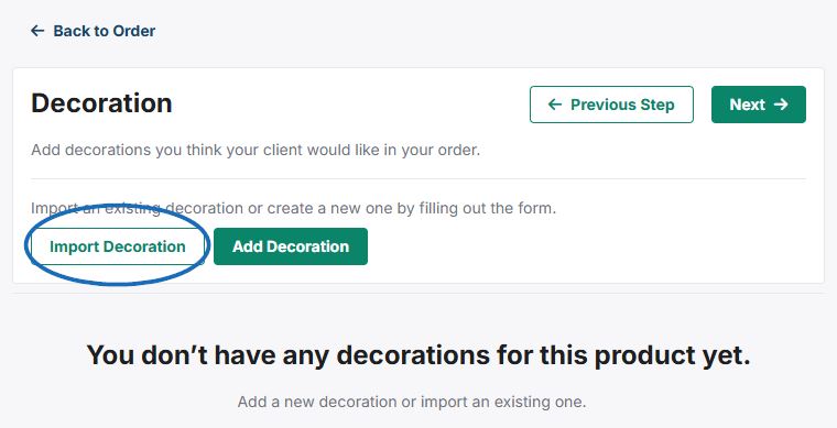
To apply a previously configured imprint template, use the drop-down to select the company and then click on the decoration you would like to apply. Select the decoration and then click on the Import Decoration button.
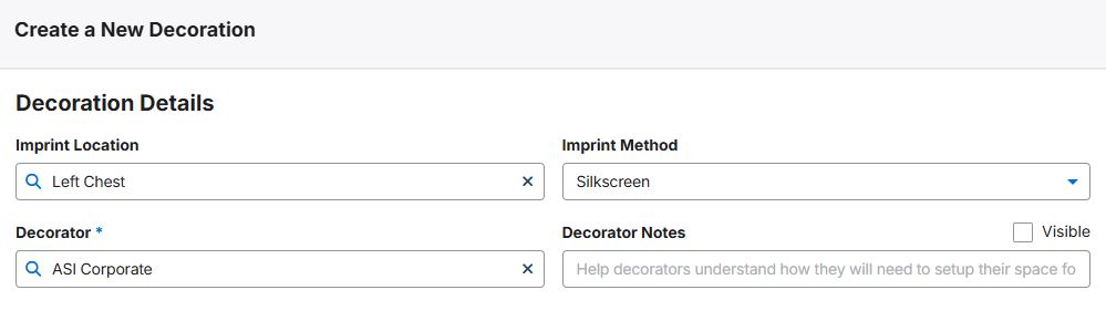
Click on the Add Decoration button to configure new decoration information. If the supplier provides imprinting for this product, the supplier's information will be automatically filled in for the Decorator field.
Enter information for the Imprint Location, Imprint Method, Decorator (if Supplier is does not provide imprinting), and Decorator Notes.
Note: If you need to update the Decorator, the Decorator company you would like to use must be an active company within CRM.
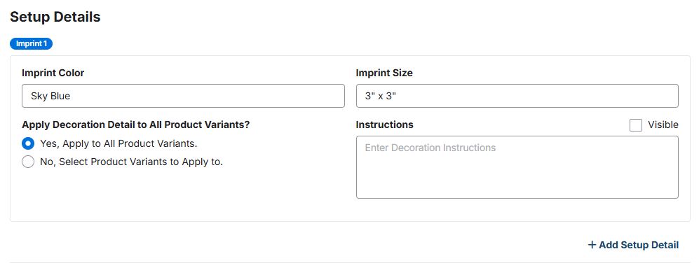
Use the Imprint Color and Imprint Size fields to indicate the color and size of the decoration. The "Apply Decoration Detail to All Product Variants?" option enables you to indicate specific decoration criteria for selected variants. For example, you are ordering T-Shirts in both black and white. A white logo on a black shirt will display well, but it would not be visible on the black shirt, so you could choose "Select Variants" to indicate that the logo should be imprinted in white on the black shirts and then click on the "+ Add Setup Detail" link to include a section imprint indicating that the logo should be imprinted in black on the white shirts. You can also include any instructions for the decoration.
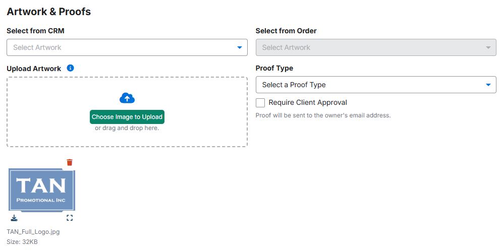
In Artwork & Proofs section, you can upload any applicable artwork files for this product. Artwork can be selected from the customer's CRM record, selected from a previous order, and/or uploaded from your computer. This section also enables you to select a proof type and indicate if client approval is required.
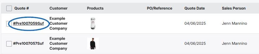
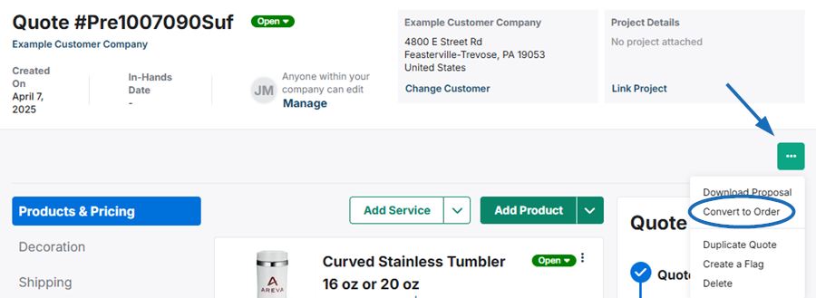
After the customer has approved the quote, you are able to convert it to an order which will automatically create the purchase order(s). To do this, click on Projects from the main toolbar, then click on Orders.
Next, locate the quote and click on the quote number.
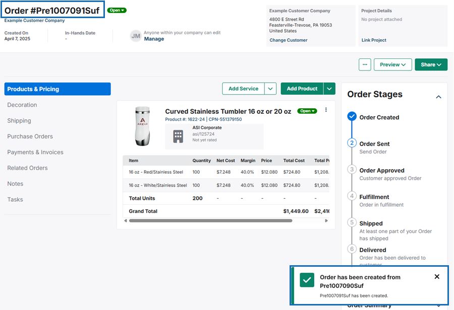
The newly created order will open with a success message in the lower right corner. The purchase orders will be available via the options in the left side menu.
To add products to an existing quote, click on the Add Products button. In this window, you can search for products, select items from an existing collection, presentation, and/or order, as well as create a custom product.
The Quick Add option enables you to select from any item in ESP by entering search terms in the "What are you looking for?" box. Type keywords, product numbers, or customer product numbers in the box. To search for your company’s existing custom products, type your ASI Number in this box and then select the product or products you would like to include on the quote.

The Collection option enables you to select any item that has been saved in a Collection. Use the "Select a Collection" dropdown to view the five most recent collections. You can also use the Search Collections box to type a collection name. Click on the collection listing to display items within and then select the product or products you would like to include on the quote.
The Presentation option enables you to select any item that has been included in a presentation. Use the "Select a Presentation" dropdown to type a presentation name. Click on the presentation listing to display items within and then select the product or products you would like to include on the quote.
The Order option enables you to select any item that has been included in an order. Use the "Select an Order" dropdown to view recent orders or use the Search Orders box to type an order number, company name, or project name. Click on the order listing to display items within and then select the product or products you would like to include on the quote.
The Custom Product section enables you to create a quote with a custom item on the fly. While the Product Name and Supplier are required, it is recommended that you include as much information as possible. Once you have finished entering information, click on the "Add Custom Product" button. It is important to note that custom products created for order documentation will not be uploaded to the ESP+ database. If you would like to add a custom product that has already been uploaded to ESP+, you can use the Quick Add option.
For more information regarding custom products, please review the Create Order Documents with Custom Products article.
Selected products will be moved into the Selected Products & Services section and will be included on the quote. If you need to remove a product, click on this icon. When you are finished, click on the “Add Products” button.
The items will now be available to configure and update the product information on the quote. It is important to note that items added from an existing order will be include with any configurations from the previous order.
You can continue to include additional products by clicking on the Add Products button.
To send multiple products to your customer at one time, first search for the product keyword, then check the box in the top left of each product you want to send.
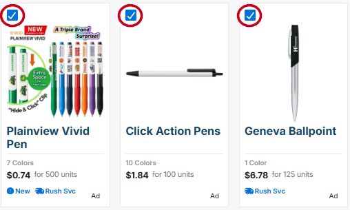
A blue taskbar will appear at the bottom of the screen. Click on the "Send to Customer" button.

A window will open where you can preview and send the products. Enter the recipient email address, subject line, and optional message, then click on the "Send" button. You can also click on the "Copy Link" button to copy a link to the products to send to your customer in an email.
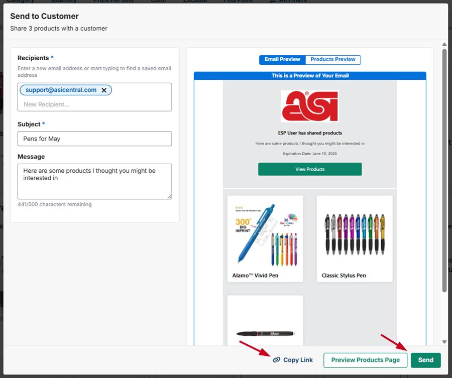
Note: You can also send a single product by clicking on the product from the search results and clicking on the "Send to Customer" button from the product detail page.
To customize the product information prior to sharing with a customer, create a presentation. To share multiple types of products with the customer, create and share a collection.
You can send multiple products to your customers at one using two methods: Via the search results page or via a collection.
To send products via the search results page, first search for the product keyword, then check the box in the top left of each product you want to send. A blue taskbar will appear at the bottom of the screen. Click on the "Send to Customer" button and you can send the products from the window that opens.
Using this method you can send multiple products quickly, however you are not able to organize the products before sending them, and you will not have access to the product information after sending the products.
To send a collection, open the collection you want to send, and click the "Send to Customer" button, then you can send the entire collection from the window that opens.
Before sending the collection you are able to arrange the products using the available options in the "Arrange By" menu, or separate the products into sections within the collection. The collection will also remain in ESP+ for your use and reference after you send it to the customer.
Projects are the central hub for all aspects of an event and contains all related information, such as the customer, presentations, and order documents, as well as the event type, important dates, budget, and number of attendees. Creating a presentation means that you are creating a component of the Project, so they are added simultaneously.
After completing a product search in ESP+, an individual product can be added to a presentation, or multiple products can be selected and added to the presentation.
To create a presentation using a single product from the general search results, click on the plus icon that appears in the upper right corner when you hover over the product listing and choose "Add to Presentation".
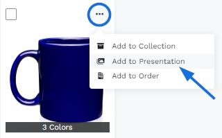
You can then begin to configure the project details.
If you would like to use multiple items from a search in a presentation, mark the products by clicking the checkbox in the
upper left corner of the product listing. Mark all the items you would like to use.
Note: If you would
like to create a presentation using items from multiple searches, you can create a collection and then begin the presentation
from the collection.
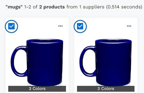
Once you've marked items, click on the "Create Presentation" button shown on the toolbar at the bottom.

You can then begin to configure the project details.
If you have items in a collection, there are three ways to move the product(s) into a presentation:
Locate the product you would like to use and then click on the icon that appears in the upper right corner when you hover over the the product listing. Then, select "Add to Presentation".
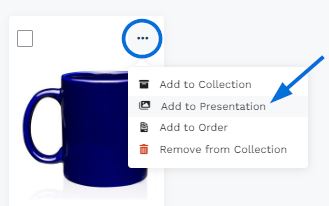
To select specific items from a collection to use in a presentation, mark the items using the checkbox. A toolbar will appear
at the bottom. Click on the "Create Presentation" button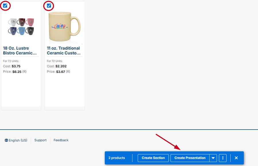
To use all items within a collection to create a presentation, click on the "Add to Presentation" button at the top.

You can then begin to configure the project details.
From the main toolbar, click on the Presentations option.

Then, click on the Create a New Presentation button.

You can then begin to configure the project details.
Within a company record in CRM there is a section for Product History. To open a company record, click on CRM from the main toolbar. If the company is displayed in the recent companies list, click on their name to open their record. If not, click on the All CRM link
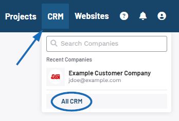
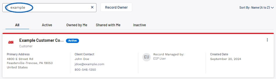
Use the search to locate the company. Once you have located the company, click anywhere in their listing.
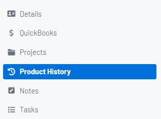
Then, click on Product History from the available options.
This section contains information on items previously presented to the customer and organizes them accordingly using tabs. From any tab, you can add one or more products to a presentation.
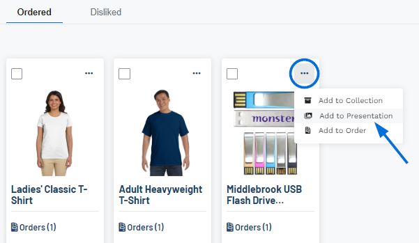
Locate the product you would like to use and then click on the plus icon in the upper right corner of the product listing. Then, select "Add to Presentation".
To select specific items from the product history to use in a presentation, mark the items using the checkbox.
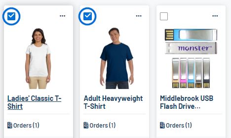
A toolbar will appear at the bottom. Click on the "Add to Presentation" option.